
Here is a quick demo of some of the new functionality in AQP as of version 0.99-9.2. The demos below are based on soil profiles from an archive described in (Carre and Girard, 2002) available on the OSACA page. A condensed version of the collection is available as a SoilProfileCollection object in the AQP sample dataset "sp5". UPDATE 2010-01-12 Syntax has changed slightly, as profileApply() now iterates over a list of SoilProfileCollection objects, one for each profile from the original object.
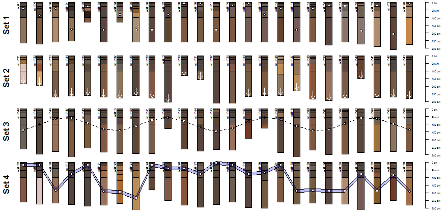
Image: AQP Sample Dataset 5: Profile Sketches
Setup environment, and try some simple examples.
library(aqp)
library(scales)

# load sample data -- SoilProfileCollection class object
data(sp5)
# check out the show() method
sp5
# more information:
?sp5

# 4x1 matrix of plotting areas
layout(matrix(c(1,2,3,4), ncol=1), height=c(0.25,0.25,0.25,0.25))

# reduce figure margins
par(mar=c(0,0,0,0))

# plot profiles, with points added to the mid-points of randomly selected horizons
sub <- sp5[1:25, ]
plot(sub, max.depth=300) ; mtext('Set 1', 2, line=-1.5, font=2)
y.p <- profileApply(sub, function(x) {s <- sample(1:nrow(x), 1) ; h <- horizons(x); with(h[s,], (top+bottom)/2)})
points(1:25, y.p, bg='white', pch=21)

# plot profiles, with arrows pointing to profile bottoms
sub <- sp5[26:50, ]
plot(sub, max.depth=300); mtext('Set 2', 2, line=-1.5, font=2)
y.a <- profileApply(sub, function(x) max(x))
arrows(1:25, y.a-50, 1:25, y.a, len=0.1, col='white')

# plot profiles, with points connected by lines: ideally reflecting some kind of measured data
sub <- sp5[51:75, ]
plot(sub, max.depth=300); mtext('Set 3', 2, line=-1.5, font=2)
y.p <- 20*(sin(1:25) + 2*cos(1:25) + 5)
points(1:25, y.p, bg='white', pch=21)
lines(1:25, y.p, lty=2)

# plot profiles, with polygons connecting horizons with max clay content (+/-) 10 cm
sub <- sp5[76:100, ]
y.clay.max <- profileApply(sub, function(x) {i <- which.max(x$clay) ; h <- horizons(x); with(h[i, ], (top+bottom)/2)} )
plot(sub, max.depth=300); mtext('Set 4', 2, line=-1.5, font=2)
polygon(c(1:25, 25:1), c(y.clay.max-10, rev(y.clay.max+10)), border='black', col=rgb(0,0,0.8, alpha=0.25))
points(1:25, y.clay.max, pch=21, bg='white')
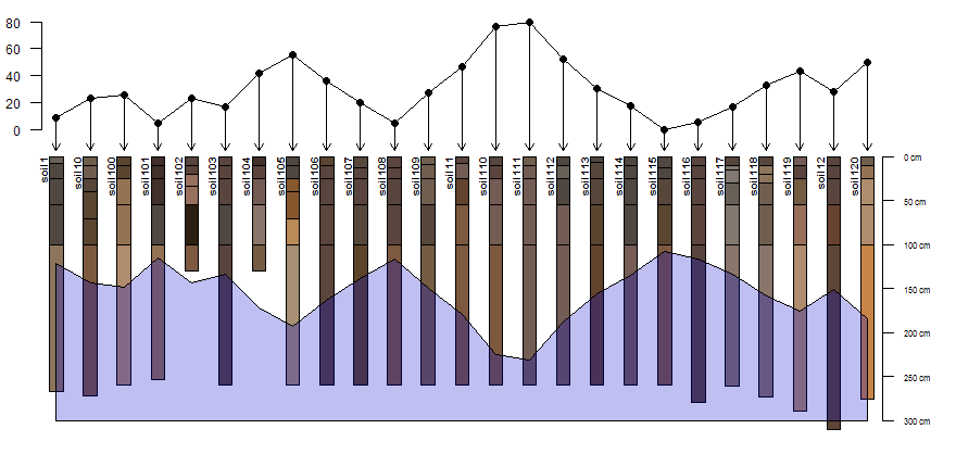
Image: AQP Sample Dataset 5: Profile Sketches and Environmental Gradients
Plot simulated environmental gradients above/below soil profiles.
# plotting parameters
yo <- 100 # y-offset
sf <- 0.65 # scaling factor
# plot profile sketches
par(mar=c(0,0,0,0))
plot(sp5[1:25, ], max.depth=300, y.offset=yo, scaling.factor=sf)
# optionally add describe plotting area above profiles with lines
# abline(h=c(0,90,100, (300*sf)+yo), lty=2)
# simulate an environmental variable associated with profiles (elevation, etc.)
r <- vector(mode='numeric', length=25)
r[1] <- -50 ; for(i in 2:25) {r[i] <- r[i-1] + rnorm(mean=-1, sd=25, n=1)}
# rescale
r <- rescale(r, to=c(80, 0))
# illustrate gradient with points/lines/arrows
lines(1:25, r)
points(1:25, r, pch=16)
arrows(1:25, r, 1:25, 95, len=0.1)
# add scale for simulated gradient
axis(2, at=pretty(0:80), labels=rev(pretty(0:80)), line=-1, cex.axis=0.75, las=2)
# depict a secondary environmental gradient with polygons (water table depth, etc.)
polygon(c(1:25, 25:1), c((100-r)+150, rep((300*sf)+yo, times=25)), border='black', col=rgb(0,0,0.8, alpha=0.25))
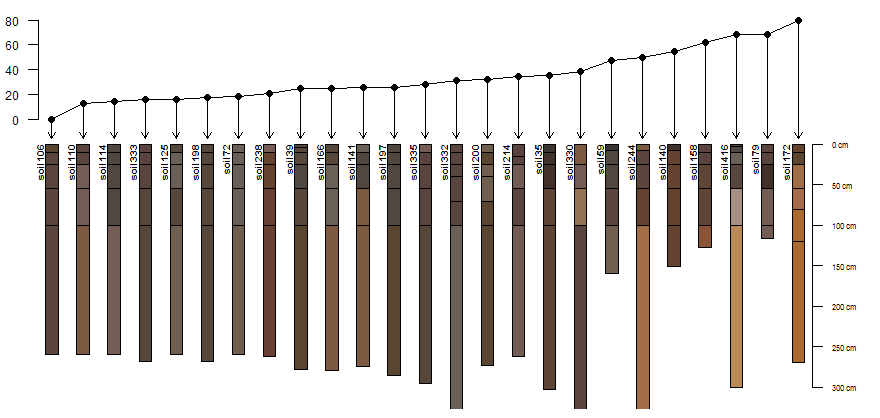
Image: AQP Sample Dataset 5: Profile Sketches and Between-Profile Dissimilarity
Compute and display dissimilarity between profile 1 (left-most) and other 24 profiles, from a random sampling of 25.
# sample 25 profiles from the collection
s <- sp5[sample(1:length(sp5), size=25), ]
# compute pair-wise dissimilarity
d <- profile_compare(s, vars=c('R25','pH','clay','EC'), k=0, replace_na=TRUE, add_soil_flag=TRUE, max_d=300)
# keep only the dissimilarity between profile 1 and all others
d.1 <- as.matrix(d)[1, ]
# rescale dissimilarities
d.1 <- rescale(d.1, to=c(80, 0))
# sort in ascending order
d.1.order <- rev(order(d.1))
# plotting parameters
yo <- 100 # y-offset
sf <- 0.65 # scaling factor
# plot sketches
plot(s, max.depth=300, y.offset=yo, scaling.factor=sf, plot.order=d.1.order)
# add dissimilarity values with lines/points
lines(1:25, d.1[d.1.order])
points(1:25, d.1[d.1.order], pch=16)
# link dissimilarity values with profile sketches via arrows
arrows(1:25, d.1[d.1.order], 1:25, 95, len=0.1)
# add an axis for the dissimilarity scale
axis(2, at=pretty(0:80), labels=rev(pretty(0:80)), line=-2, cex.axis=0.75, las=2)
