Creating a Custom Panel Function (R - Lattice Graphics)
Jul 30, 2008 metroadminThe Experiment
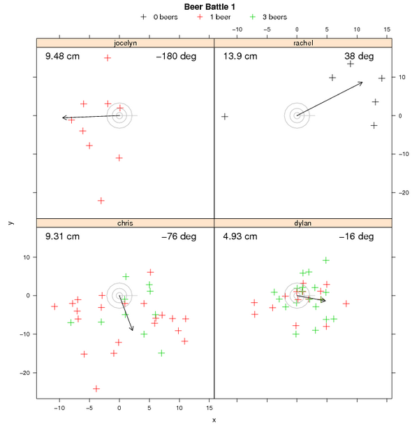
It was necessary (for the purposes of this exercise) to generate some grouped data worthy of a creative panel function. An experiment was designed to test the coordination of 4 individuals (each a panel in the figure below), as a function of "clarity of mind" (symbol color in the figure below). The actual details of the experiment can be deduced from the attached data file, and careful inspection of the resulting plot. A similar experiment was conducted some time ago to demonstrate the Spatstat package in R.
A Customized Panel Function for Lattice Graphics -- "panel.bulls_eye()"
Lattice graphics are one of several possible visualization methods in available in R that are most useful when working with grouped data. Plots are generated via a formula interface, often in the format of y ~ x | f -- where y is the dependent variable, x is the independent variable, and f is a grouping factor. Have a look at the attached file (bottom of page) for an example of data in this format. Each panel in the plot is generated by a panel function, using a subset of the original data as defined by the grouping variable. In most situations the standard panel functions, such as panel.xyplot, are sufficient. However, when working with more "interesting" data, a customized panel function is the way to go.
In order to try the sample code out, you will need to:
- install the required packages
- copy and paste the panel.bulls_eye function source into an R session
- download the sample data file
- run the code listed in the sample R session
Since panel functions are made to be generic, any data source that is similar in nature to the sample can be directly plotted using this code-- i.e. if the experiment were to be repeated using 8 subjects instead of 4. Enjoy.
Panel Function Source
panel.bulls_eye <- function(x, y, groups, subscripts, ...)
{
# setup the initial plot, and add the raw data
panel.xyplot(jitter(x), jitter(y), groups=groups, subscripts=subscripts, cex=1.25, pch=3, col=c(1,2,3), ...)

# add the bull's eye
panel.points(0, 0, pch=16, cex=0.25, col='grey')
panel.points(0, 0, pch=1, cex=1.75, col='grey')
panel.points(0, 0, pch=1, cex=4, col='grey')
panel.points(0, 0, pch=1, cex=7, col='grey')

# compute the mean cartesian distance from the bull's eye to all points
z <- signif(mean(sqrt(x^2 + y^2)), 3)
z.text <- paste(z, 'cm')

# compute the mean angle between all points and bull's eye
theta <- circ.mean(atan2(y, x))
theta.text <- paste(signif(theta* 180/pi, 2), 'deg')

# generate a displacement vector
x_prime <- z * cos(theta)
y_prime <- z * sin(theta)

# add the vector to the plot
panel.segments(0, 0, 3, 0, col='grey')
panel.arrows(0, 0, x_prime, y_prime, length=0.1, col='black')

# annotate with accuracy and displacement angle
grid.text(label = z.text, gp=gpar(fontsize=16), just='left',
              x = unit(0.05, "npc"),
              y = unit(0.95, "npc"))
grid.text(label = theta.text, gp=gpar(fontsize=16), just='right',
              x = unit(0.90, "npc"),
              y = unit(0.95, "npc"))
}
Example Session (note that several packages are required)
# load required libraries
library(spatstat)
library(lattice)
library(grid)
library(CircStats)

# read in our data (see attached file)
x <- read.csv('beer_battle.csv')

# plot the data, as stratified by person
xyplot(y ~ x | person, groups=beer, data=x, panel=panel.bulls_eye,
key=list(points=list(col=c(1,2,3), pch=c(3,3,3)), text=list(c('0 beers', '1 beer', '3 beers')), columns=3),
main='Beer Battle 1'
)

Results: example output from the panel.bulls_eye() function used with xyplot().
Attachment:
Links:
Computing Statistics from Poorly Formatted Data (plyr and reshape packages for R)
R: advanced statistical package
Customized Scatterplot Ideas
Software
- General Purpose Programming with Scripting Languages
- LaTeX Tips and Tricks
- PostGIS: Spatially enabled Relational Database Sytem
- PROJ: forward and reverse geographic projections
- GDAL and OGR: geodata conversion and re-projection tools
- R: advanced statistical package
- Access Data Stored in a Postgresql Database
- Additive Time Series Decomposition in R: Soil Moisture and Temperature Data
- Aggregating SSURGO Data in R
- Cluster Analysis 1: finding groups in a randomly generated 2-dimensional dataset
- Color Functions
- Comparison of Slope and Intercept Terms for Multi-Level Model
- Comparison of Slope and Intercept Terms for Multi-Level Model II: Using Contrasts
- Creating a Custom Panel Function (R - Lattice Graphics)
- Customized Scatterplot Ideas
- Estimating Missing Data with aregImpute() {R}
- Exploration of Multivariate Data
- Interactive 3D plots with the rgl package
- Making Soil Property vs. Depth Plots
- Numerical Integration/Differentiation in R: FTIR Spectra
- Plotting XRD (X-Ray Diffraction) Data
- Using lm() and predict() to apply a standard curve to Analytical Data
- Working with Spatial Data
- Comparison of PSA Results: Pipette vs. Laser Granulometer
- GRASS GIS: raster, vector, and imagery analysis
- Generic Mapping Tools: high quality map production

