
Plotting XRD (X-Ray Diffraction) Data
Premise:
Some examples on how to prepare and present data collected from an XRD analysis. The clay fraction from seven horizons was analyzed by XRD, using the five common treatments: potassium saturation (K), potassium saturation heated to 350 Deg C (K 350), potassium saturation heated to 550 Deg C (K 550), magnesium saturation (Mg), and magnesium + glycerin saturation (Mg+GLY). These data files have been attached, and can be found near the bottom of the page.
Plotting the entire data set with lattice graphics:
## load libs
require(lattice)
require(reshape)

## read the composite data in as a table
## format is 2theta,MG,MG+GLY,K,K350,K550
h1 <- read.csv("tioga1_0-8.csv", header=FALSE)
h2 <- read.csv("tioga1_8-15.csv", header=FALSE)
h3 <- read.csv("tioga1_15-35.csv", header=FALSE)
h4 <- read.csv("tioga1_35-65.csv", header=FALSE)
h5 <- read.csv("tioga1_65-90.csv", header=FALSE)
h6 <- read.csv("tioga1_90-120.csv", header=FALSE)
h7 <- read.csv("tioga1_120-150.csv", header=FALSE)


## load some common d-spacings:
d_spacings <- c(0.33,0.358,0.434,0.482,0.717,1,1.2,1.4,1.8)
d_spacing_labels <- c(".33", ".36", ".43", ".48", ".7","1.0","1.2","1.4","1.8")

## combine horizons, and
xrd <- make.groups(h1, h2, h3, h4, h5, h6, h7)
names(xrd) <- c('x', 'MG', 'MG+GLY', 'K', 'K 350', 'K 550', 'horizon')

## convert data into long format
xrd.long <- melt(data=xrd, id.var=c('x', 'horizon'), measure.var=c('K','K 350', 'K 550', 'MG', 'MG+GLY'), variable_name='treatment')

## set a better ordering of the treatments
xrd.long$treatment <- ordered(xrd.long$treatment, c('MG', 'MG+GLY', 'K', 'K 350', 'K 550'))


## change the strip background colors
##  trellis.par.set(list(strip.background = list(col = grey(c(0.9,0.8)) )))

## plot the data along with some common d-spacings:
xyplot(value ~ x | treatment + horizon , data=xrd.long, as.table=TRUE, ylim=c(0,500), xlab='Deg 2Theta', ylab='Counts', panel=function(x, y, ...) {panel.abline(v=(asin(0.154/(2*d_spacings)) * 180/pi * 2), col=grey(0.9)) ; panel.xyplot(x, y, ..., type='l', col='black')} )

## another approach: labels on the side
xyplot(value ~ x | horizon + treatment , data=xrd.long, as.table=TRUE, ylim=c(0,500), xlab='Deg 2Theta', ylab='Counts', panel=function(x, y, ...) {panel.abline(v=(asin(0.154/(2*d_spacings)) * 180/pi * 2), col=grey(0.9)) ; panel.xyplot(x, y, ..., type='l', col='black')}, strip.left=TRUE, strip=FALSE)
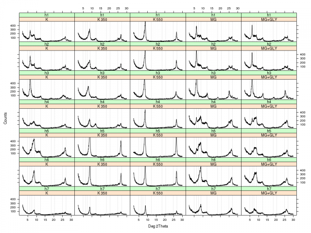
Example XRD plot with lattice graphics: 7 horizons and 5 treatments
Attachments:
tioga1_8-15.csv_.txt
tioga1_0-8.csv_.txt
tioga1_15-35.csv_.txt
tioga1_35-65.csv_.txt
tioga1_65-90.csv_.txt
tioga1_90-120.csv_.txt
tioga1_120-150.csv_.txt
