
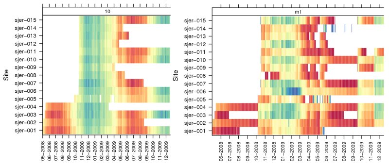
Figure: levelplot example: soil temperature (left) and moisture (right)
Several recent articles appeared on the R-bloggers feed aggregator that demonstrated an interesting visualization of time series data using color. This style of visualization was readily adapted for the time series data I regularly collect (soil moisture and temperature), and quickly implemented with the levelplot() function from the lattice package. I hadn't previously considered using a mixture of factor (categorical) and continuous variables within a call to levelplot(), however the resulting figure was more useful than expected (see above). A single day's observation is represented by a colored strip (redder hues are higher temperature values, and lower soil moisture values), placed along the x-axis according to the date of that observation, and in a row defined by the location where that observation was collected from. Paneling of the data can be used to represent a more complex hierarchy, such as sensor depth or landscape position. At the expense of quantitative data retrieval (which is better supported be scatter plots), qualitative patterns are quickly identified within the new graphic.
Basic Implementation
levelplot(pct_saturation ~ date*pedon_id | factor(probe_id),
data=moisture, layout=c(3,1),
as.table=TRUE, xlab='Date', ylab='Site',
scales=list(y=list(alternating=1), x=list(alternating=1, rot=90, format="%m-%Y", cex=0.75, at=d.list)),
strip=strip.custom(par.strip.text=list(cex=0.75), bg=NA),
auto.key=list(columns=4, lines=TRUE, points=FALSE, cex=0.75),
main='Daily Mean % Saturation', col.regions=rev(cols.palette(ncuts)), cuts=ncuts-1,
subset=pct_saturation >= 0 & pct_saturation <= 1
