
This is a quick update to some code posted while back, related to plotting filled polygons within a lattice panel function. After attempting to use the originally described function to plot data with NA, I quickly realized that a more robust approach was required-- panel.polygon() does not deal well with missing data. A new function of the same name is attached at the bottom of the page, and some code demonstrating its use is presented below. The rle() function (run-length encoding) does most of the difficult work of identifying contiguous chunks of non-missing data. Each chunk is plotted as a separate polygon, resulting in a (mostly) generalized panel function for plotting filled polygons within the lattice framework. Comments welcome.
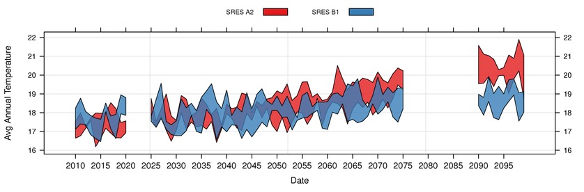
FIgure: panel.tsplot() example
Demo
# Code originally by D.E. Beaudette and V. Mehta
library(lattice)
library(RColorBrewer)

# see attached file at bottom of page
source('panel.tsplot.R')

# setup query parameters
row <- 8 ; col <- 121 ; scale <- 1

# build URL: this is the new approach to loading data
u <- url(sprintf("http://www.climatechange.ca.gov/visualization/sei_temp/weadapt_www_site/data_export.php?format=csv&row=%i&col=%i&scale=%i&query_type=climatets", row, col, scale))

# read file from URL
x <- read.csv(u)

# fix the date
x$date <- as.Date(x$date)

##
## lets make things interesting and remove a couple slices of data
##
x$mean_temp[x$date > as.Date('2020-01-01') & x$date < as.Date('2025-01-01')] <- NA
x$mean_temp[x$date > as.Date('2075-01-01') & x$date < as.Date('2090-01-01')] <- NA

# get date range
d.range <- range(x$date)
d.list <- seq(d.range[1], d.range[2], by='5 years')

# setup colors and line types
area.cols <- brewer.pal('Set1', n=9)
line.cols <- rep(area.cols[1:2], each=3)
line.lty <- rep(c(1,2,3), times=2)

# customize plotting device
trellis.par.set('superpose.polygon'=list(col=area.cols))
trellis.par.set('superpose.line'=list(col=line.cols, lty=line.lty))
trellis.par.set('layout.widths'=list(ylab.axis.padding=3))

# plot
xyplot(mean_temp ~ date, groups=emission, data=x, scales=list(y=list(alternating=3), x=list(format="%Y", cex=1, at=d.list)), auto.key=list(columns=2, rectangles=TRUE, lines=FALSE, points=FALSE, cex=0.75), xlab='Date', ylab="Avg Annual Temperature", panel=panel.tsplot)
Attachment: panel.tsplot.R
