
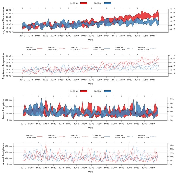
Recently finished some collaborative work with Vishal, related to visualizing climate change data for the SEI. This project was funded in part by the California Energy Commission, with additional technical support from the Google Earth Team. One of the final products was an interactive, multi-scale Google Earth application, based on PostGIS, PHP, and R. Interaction with the KMZ application results in several presentations of climate projections, fire risk projections, urban population growth projections, and other related information. Charts are dynamically generated from the PostGIS database, and returned to the web browser. In addition, an HTTP-based interface makes it simple to download CSV-formatted data directly from the CEC server. Some of our R code seemed like a good candidate for sharing, so I have posted a complete example below-- illustrating how to access climate projection data from the CEC server, a couple custom functions for fancy lattice graphics, and more.
User Functions
# load libs
library(lattice)
library(RColorBrewer)

# function defs
# custom panel function for plotting filled polygons
# may not generalize well to paneling... [not tested]
panel.tsplot <- function(x, y, groups=groups, ...)
        {

        # generate temp DF
        d <- data.frame(date=x, val=y, g=groups)

        # levels of groups
        ll <- levels(d$g)

        # layout simple grid
        panel.grid(h=-1, v=-1)

        # iterate over groups
        by(d, d$g, function(d_i)
                {
                # get number of the current group
                m <- match(unique(d_i$g), ll)

                # generate vectors for polygon boundary
                d.date <- unique(d_i$date)
                d.max <- with(d_i, tapply(val, date, max, na.rm=TRUE))
                d.min <- with(d_i, tapply(val, date, min, na.rm=TRUE))

                # plot the polygon for this group
                panel.polygon(x=c(d.date, rev(d.date)), y=c(d.max, rev(d.min)), col=trellis.par.get('superpose.polygon')$col[m], border=1, alpha=0.8)
                })
        }

#
# from yscale.components.default() manual page
#
# conversion functions
F2C <- function(f) 5 * (f - 32) / 9
C2F <- function(c) 32 + 9 * c / 5

mm2in <- function(mm) mm * 0.0393700787
in2mm <- function(inch) inch * 25.4

# nice axis for deg C / deg F temperatures
axis.CF <- function(side, ...)
{
        ylim <- current.panel.limits()$ylim
        switch(side,
                right = {
                        prettyF <- pretty(C2F(ylim))
                        labF <- parse(text = sprintf("%s ~ degree * F", prettyF))
                        panel.axis(side = side, outside = TRUE,
                                                at = F2C(prettyF), labels = labF)
                },
                left = {
                        prettyC <- pretty(ylim)
                        labC <- parse(text = sprintf("%s ~ degree * C", prettyC))
                        panel.axis(side = side, outside = TRUE,
                                                at = prettyC, labels = labC)
                },
                axis.default(side = side, ...))
}

#
# from yscale.components.default() manual page
#
# nice axis for mm / in rainfall
axis.MM.IN <- function(side, ...)
{
        ylim <- current.panel.limits()$ylim
        switch(side,
                right = {
                        pretty_in <- pretty(mm2in(ylim))
                        lab_in <- parse(text = sprintf("%s ~ in.", pretty_in))
                        panel.axis(side = side, outside = TRUE,
                                                at = in2mm(pretty_in), labels = lab_in)
                },
                left = {
                        pretty_mm <- pretty(ylim)
                        lab_mm <- parse(text = sprintf("%s ~ mm", pretty_mm))
                        panel.axis(side = side, outside = TRUE,
                                                at = pretty_mm, labels = lab_mm)
                },
                axis.default(side = side, ...))
}
Load Data from CEC Server
# Code originally by D.E. Beaudette and V. Mehta
# setup query parameters
row <- 8 ; col <- 121 ; scale <- 1

# build URL: this is the new approach to loading data
u <- url(sprintf("http://www.climatechange.ca.gov/visualization/sei_temp/weadapt_www_site/data_export.php?format=csv&row=%i&col=%i&scale=%i&query_type=climatets", row, col, scale))

# read file from URL
x <- read.csv(u)

# fix the date
x$date <- as.Date(x$date)

# get date range
d.range <- range(x$date)
d.list <- seq(d.range[1], d.range[2], by='5 years')
Compose Figure
mean_temp <- xyplot(mean_temp ~ date, groups=paste(emission,model, sep="\n"), data=x, type=c('g','l'), scales=list(y=list(alternating=3), x=list(format="%Y", cex=1, at=d.list)), auto.key=list(columns=6, lines=TRUE, points=FALSE, cex=0.75, size=4, between=1), xlab='Date', ylab="Avg Annual Temperature", axis=axis.CF)

mean_temp.polygon <- xyplot(mean_temp ~ date, groups=emission, data=x, scales=list(y=list(alternating=3), x=list(format="%Y", cex=1, at=d.list)), auto.key=list(columns=2, rectangles=TRUE, lines=FALSE, points=FALSE, cex=0.75), xlab='Date', ylab="Avg Annual Temperature", panel=panel.tsplot, axis=axis.CF)

ann_precip <- xyplot(sum_precip ~ date, groups=paste(emission,model, sep="\n"), data=x, type=c('g','l'), scales=list(y=list(alternating=3), x=list(format="%Y", cex=1, at=d.list)), auto.key=list(columns=6, lines=TRUE, points=FALSE, cex=0.75, size=4, between=1), xlab='Date', ylab="Annual Precipitation", axis=axis.MM.IN)

ann_precip.polygon <- xyplot(sum_precip ~ date, groups=emission, data=x, scales=list(y=list(alternating=3), x=list(format="%Y", cex=1, at=d.list)), auto.key=list(columns=2, rectangles=TRUE, lines=FALSE, points=FALSE, cex=0.75), xlab='Date', ylab="Annual Precipitation", panel=panel.tsplot, axis=axis.MM.IN)


# setup colors and line types
area.cols <- brewer.pal('Set1', n=9)
line.cols <- rep(area.cols[1:2], each=3)
line.lty <- rep(c(1,2,3), times=2)

# generate a file name
filename <- paste('climate_ts_figure', '-', row, '_', col, '_', scale, '.png', sep='')

# start the file
png(file=filename, width=900, height=900)

# customize plotting device
trellis.par.set('superpose.polygon'=list(col=area.cols))
trellis.par.set('superpose.line'=list(col=line.cols, lty=line.lty))
trellis.par.set('layout.widths'=list(ylab.axis.padding=3))

print(mean_temp.polygon, pos=c(0, 0.75, 1, 1), more=TRUE)
print(mean_temp, pos=c(0, 0.5, 1, 0.75), more=TRUE)

print(ann_precip.polygon, pos=c(0, 0.25, 1, 0.5), more=TRUE)
print(ann_precip, pos=c(0, 0, 1, 0.25), more=FALSE)

# close the image
dev.off()
