
The CDEC website provides access to a wide range in hydrologic data (stream flow, snow survey, etc.) collected in California. The following code and functions (attached at the bottom of the page) illustrate how to query CDEC, and graphically compare the May 2011 snow survey data with the historic record at 15 sites. Data in this format lend well to the "split-apply-combine" strategy. Integration of several figures (scatter plot, custom box-whisker plot) and graphical legend for bwplot is accomplished via the latticeExtra package. See in-line comments below for a more complete description of the code.
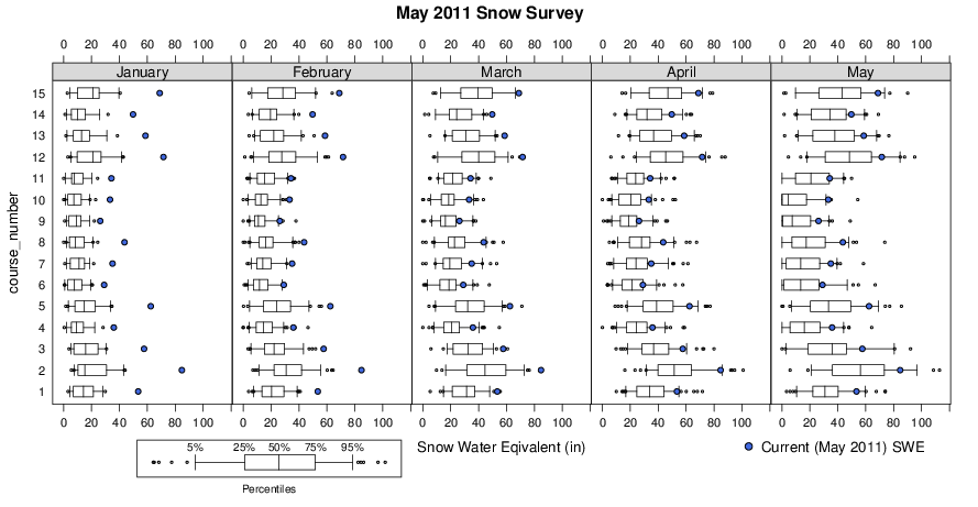
Note that snow water equivalent (SWE) from May 2011 (blue dots) is compared with the historic record (box-whisker plots) for the months of Jan-May. Pretty impressive snowfall!
Define Custom Functions
# custom panel function, run once within each lattice panel
panel.SWE <- function(x, y, ...) {
        # make box-whisker plot
        panel.bwplot(x, y, ...)
        # tabulate number of obs (years) of data per station
        course.levels <- levels(y)
        n.yrs <- tapply(x, y, function(i) length(na.omit(i)))
        # determine station position on y-axis
        y.pos <- match(names(n.yrs), course.levels)
        # add 'yrs'
        n.yrs.txt <- paste('(', n.yrs, ' yrs)', sep='')
        # annotate panel with number of years / box-whisker
        grid.text(label=n.yrs.txt, x=unit(0.99, 'npc'), y=unit(y.pos, 'native'), gp=gpar(cex=0.65, font=2), just='right')
}

# custom stats for box-whisker plot: 5th-25th-50th-75th-95th percentiles
custom.bwplot <- function(x, coef=NA, do.out=FALSE) {
        stats <- quantile(x, p=c(0.05, 0.25, 0.5, 0.75, 0.95))
        n <- length(na.omit(x))
        out.low <- x[which(x < stats[1])]
        out.high <- x[which(x > stats[5])]
        return(list(stats=stats, n=n, conf=NA, out=c(out.low, out.high)))
}


# fetch and format monthly data by course number, starting year, and ending year
getMonthly <- function(course, start_yr, end_yr) {
        # construct the URL for the DWR website
        u <- paste(
                'http://cdec.water.ca.gov/cgi-progs/snowQuery?course_num=', course,
                '&month=(All)&start_date=', start_yr,
                '&end_date=', end_yr,
                '&csv_mode=Y&data_wish=Retrieve+Data',
                sep='')

        # read the result of sending the URL as a CSV file:
        # noting that it has a header,
        # skipping the first line
        # not converting characters to factors
        # interpreting '        --' as NA
        d <- read.csv(file=url(u), header=TRUE, skip=1, as.is=TRUE, na.strings='        --')

        # compute the density, as percent
        d$density <- (d$Water / d$Depth) * 100.0

        # add SWE collumn using Adjusted if present
        d$SWE <- ifelse(is.na(d$Adjusted), d$Water, d$Adjusted)

        # convert date to R-friendly format
        d$Meas.Date <- as.Date(d$Meas.Date, format="%d-%B-%Y")

        # convert representative date
        # note that this month isn't the same as the month when the data were collected
        # note that we need to add an arbitrary 'day' to the string in order for it to be parsed correctly
        d$Date <- as.Date(paste('01/', d$Date, sep=''), format="%d/%m/%Y")

        # extract the year and month for reporting ease later
        d$year <- as.numeric(format(d$Date, "%Y"))
        d$month <- factor(format(d$Date, '%B'), levels=c('January','February','March','April','May','June','July','August','September','October','November','December'))

        ## note: these are computed across all months
        # compute scaled SWE (centered on mean / standardized to 1 SD)
        d$scaled.SWE <- scale(d$SWE)

        # compute empirical percentile
        d$emp.pctile <- ecdf(d$SWE)(d$SWE)

        # return the result
        return(d[, c('Meas.Date','Date','year','month','Depth','Water','Adjusted','SWE','scaled.SWE', 'emp.pctile','density')])
}
Make Figure
library(lattice)
library(grid)
library(latticeExtra)
library(plyr)

# current data are:
yr <- 2013
mo <- 'March'

# all courses in my area
course.list <- data.frame(course_number=c(129, 323, 131, 132, 134, 345, 344, 138, 139, 384, 140, 142, 143, 145, 152))

# get historic data
d.long_term <- ddply(course.list, 'course_number', .progress='text', getMonthly, start_yr=1900, end_yr=2013)

## compute long-term average, by course / month, using the Adjusted
d.long_term.avg <- ddply(d.long_term, c('course_number', 'month'), summarise,
avg.SWE=mean(SWE, na.rm=TRUE),
avg.density=mean(density, na.rm=TRUE),
avg.Depth=mean(Depth, na.rm=TRUE),
no.yrs=length(na.omit(SWE))
)

# make a copy of the current yr / mo data
d.current <- subset(d.long_term, subset=month == mo & year == yr)

# join current data with long term averages
# keep only data that exists in both tables
d.merged <- join(d.current, d.long_term.avg, by=c('course_number', 'month'), type='left')

# compute pct of normal of depth, SWE, density
d.merged$pct_of_normal_Depth <- with(d.merged, (Depth / avg.Depth) * 100.0)
d.merged$pct_of_normal_SWE <- with(d.merged, (SWE / avg.SWE) * 100.0)
d.merged$pct_of_normal_density <- with(d.merged, (density / avg.density) * 100.0)


## using customized boxplot !!
## compare with Jan, Feb, March, April, May
# new color scheme
tps <- list(box.dot=list(col='black', pch='|'), box.rectangle=list(col='black'), box.umbrella=list(col='black', lty=1), plot.symbol=list(col='black', cex=0.33))
trellis.par.set(tps)

## compare this year's data with long-term variability
p1 <- xyplot(factor(course_number) ~ SWE | month, data=d.current, fill='RoyalBlue', pch=21, cex=0.75, ylab='')
p2 <- bwplot(factor(course_number) ~ SWE | month, data=d.long_term, panel=panel.SWE, stats=custom.bwplot, xlab='Snow Water Eqivalent (in)', strip=strip.custom(bg=grey(0.85)), layout=c(5, 1), as.table=TRUE, scales=list(x=list(alternating=3)), subset=month %in% c('January','February','March','April','May'))


# combine figures
p3 <- p2 + p1

# add title, and legend
main.title <- paste(mo, yr, 'Snow Survey')
p3 <- update(p3, main=main.title, key=list(corner=c(0.97,-0.15), points=list(pch=21, fill='RoyalBlue', cex=1), text=list(paste('Current (', mo, ' ', yr, ') SWE', sep='')), between=1))

# make legend sub-plot
set.seed(101010)
x <- rnorm(100)
x.stats <- custom.bwplot(x)
p4 <- bwplot(x, stats=custom.bwplot, scales=list(draw=FALSE), xlab=list('Percentiles', cex=0.75), ylab='', ylim=c(0.5, 1.75))
p4 <- p4 + layer(panel.text(x=x.stats$stats, y=1.5, label=c('5%','25%','50%','75%','95%'), cex=0.75))

# make a file name with the current month and year
file_name <- paste('figures/', mo, '_', yr, '.pdf', sep='')

# save to file
pdf(file=file_name, width=12, height=6)
trellis.par.set(tps)
print(p3, more=TRUE, position=c(0,0.08,1,1))
print(p4, more=FALSE, position=c(0.125,0,0.425,0.175))
dev.off()


## make a table summarising results
file_name <- paste('tables/', mo, '_', yr, '.csv', sep='')
new.order <- order(d.merged$watershed)
write.csv(d.merged[new.order, c('course_number','watershed','course','elevation','Depth', 'pct_of_normal_Depth','SWE','pct_of_normal_SWE', 'density', 'pct_of_normal_density')], file=file_name, row.names=FALSE)


## another view of the data

# all data on the same SWE scale
levelplot(SWE ~ Date*factor(course_number), data=d.long_term, col.regions=brewer.pal(9, 'Blues'), cuts=8, scales=list(x=list(tick.number=20, rot=90)))

# data are all scaled by mean/sd within each course
levelplot(scaled.SWE ~ Date*factor(course_number), data=d.long_term, col.regions=brewer.pal(9, 'Spectral'), cuts=8, scales=list(x=list(tick.number=20, rot=90)))

# data have beem converted into percentiles by course number
levelplot(emp.pctile ~ Date*factor(course_number), data=d.long_term, col.regions=brewer.pal(9, 'Blues'), cuts=8, scales=list(x=list(tick.number=20, rot=90)))

# plot percentiles / by course number for the last 12 years
xyplot(emp.pctile ~ Date | factor(course_number), data=d.long_term, type=c('l','g'), as.table=TRUE, scales=list(alternating=3, x=list(tick.number=10, rot=90)), subset=Date > as.Date('2000-01-01'))

# tabular stats
ddply(d.long_term, 'course_number', summarize, median=median(SWE), IQR=IQR(SWE))
