
The rnorm() function in R is a convenient way to simulate values from the normal distribution, characterized by a given mean and standard deviation. I hadn't previously used the associated commands dnorm() (normal density function), pnorm() (cumulative distribution function), and qnorm() (quantile function) before-- so I made a simple demo. The *norm functions generate results based on a well-behaved normal distribution, while the corresponding functions density(), ecdf(), and quantile() compute empirical values. The following example could be extended to graphically describe departures from normality (or some other distribution-- see rt(), runif(), rcauchy() etc.) in a data set.
Simple Example
# sample a normal distribution, with a mean of 5 and sd of 2, 100 times
x <- rnorm(100, mean=5, sd=2)

# sort in ascending order
x.sorted <- sort(x)

# compute the empirical cumulative distribution function
x.ecdf <- ecdf(x.sorted)

# plot the expected and actual probability density
plot(x.sorted, dnorm(x.sorted, mean=5, sd=2), type='l', ylim=c(0,1), ylab='Probability', xlab='Value', main='rnorm(), dnorm(), pnorm(), and qnorm()')
lines(density(x), col=1, lty=2)

# add the expected and actual cumulative probability
lines(x.sorted, pnorm(x.sorted, mean=5, sd=2), type='l', col=2)
lines(x.sorted, x.ecdf(x.sorted), type='l', col=2, lty=2)

# add the expected and actual p=0.5 (median) and p=0.95 quantiles
abline(v=qnorm(c(0.5, 0.95), mean=5, sd=2), col=3)
abline(v=quantile(x, probs=c(0.5, 0.95)), col=3, lty=2)

# add the original x values
rug(x)

# annotate
legend('topleft', legend=c('Probability Density','Cumulative Probability','[0.5, 0.95] Quantiles'), lty=1, col=1:3, bty='n')
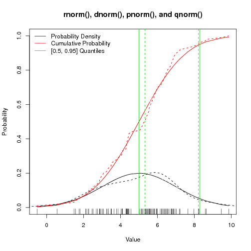
Figure: rnorm() and pals - Solid lines are expected values, dashed lines are actual values
