
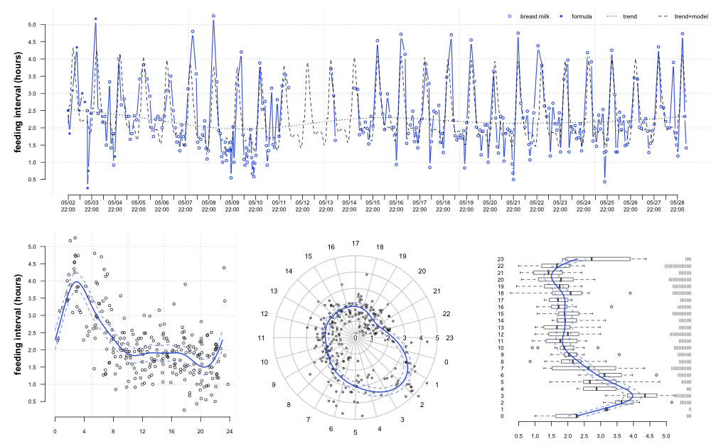
While on paternity leave I had an opportunity to test out periodic smoothing splines (within the framework of generalized additive models) on an interesting time-series-- an infant's feeding schedule.
load / format data and fit GAMs
library(plotrix)
library(mgcv)
library(plyr)

# read and format data
x <- read.csv('feeding.csv', stringsAsFactors=FALSE)
x$datetime <- as.POSIXct(strptime(x$datetime, format='%Y-%m-%d %H%M'))
x$type <- factor(x$type)
x$d <- c(NA, as.numeric(diff(x$datetime))) / 60
x$hour.fraction <- as.numeric(format(x$datetime, "%H")) + (as.numeric(format(x$datetime, "%M")) / 60)
x$hour <- as.numeric(format(round.POSIXt(x$datetime, 'hours'), "%H"))
x$date <- as.Date(x$datetime)

# get the range of our data as a POSIXct object, rounded to hours
r <- as.POSIXct(round(range(x$datetime[-1], na.rm=TRUE), "hours"))

# generate sequences that we will use later
r.seq <- seq(r[1], r[2], by="12 hours") # for the x-axis of fig. 1
p.seq <- seq(r[1], r[2], by="1 hours") # used for model predictions in fig. 1

# fit a GAM to the time-series
l.ts <- gam(d ~ s(as.numeric(datetime)), data=x)

# fit a GAM to feeding interval as smooth, periodic function of hour
l <- gam(d ~ s(hour, bs='cc'), data=x)

# generate predictions from our time-series model
d.ts <- data.frame(datetime=p.seq)
p.ts <- predict(l.ts, d.ts)
p.ts <- data.frame(d.ts, fit=as.numeric(p.ts))

# generate predictions from our hourly model
d <- data.frame(hour=seq(0, 23, length.out=100))
p <- predict(l, d, se.fit=TRUE)
p <- data.frame(d, fit=as.numeric(p$fit), se.fit=as.numeric(p$se.fit))

# estimate 95% CI from standard error
p$upper <- p$fit + 1.96*p$se.fit
p$lower <- p$fit - 1.96*p$se.fit

# generate hourly predictions for use in fig. 1
p.ts.hourly <- predict(l, data.frame(hour=as.numeric(format(p.seq, "%H"))))

# combine time-series model with hourly model predictions for fig. 1
p.ts.hourly.adjusted <- p.ts.hourly - mean(x$d, na.rm=TRUE) + p.ts$fit
plot
# setup plot layout
layout(matrix(c(1,1,1,2,3,4), nrow=2, ncol=3, byrow=TRUE), widths=c(1, 1, 1, 1))
par(mar=c(3,4.5,1,0), cex.axis=0.6, cex.lab=0.6)

# fig 1
plot(d ~ datetime, data=x, type='b', axes=FALSE, xlab='', ylab='', pch=c(1,16)[as.numeric(x$type)], cex=0.75, col='RoyalBlue', lwd=1.5)
axis(2, cex.axis=0.75, line=-0.5, las=1, at=seq(0.5, 5, 0.5))
mtext('feeding interval (hours)', side=2, cex=0.8, font=2, line=2)
lines(p.seq, p.ts.hourly.adjusted, lty=2)
lines(p.ts, lty=3)
axis.POSIXct(side=1, at=r.seq, cex.axis=0.75, format="%m/%d\n%H:%M")
grid()
legend('topright', lty=c(NA, NA, 3, 2), pch=c(1, 16, NA, NA), legend=c('breast milk', 'formula', 'trend', 'trend+model'), bty='n', cex=0.8, col=c('RoyalBlue', 'RoyalBlue', 'black', 'black'), horiz=TRUE)

# fig 2
plot(d ~ hour.fraction, data=x, axes=FALSE, xlab='', ylab='', xlim=c(-1,24), cex=0.75, col=rgb(0,0,0, alpha=0.75))
lines(p$hour, p$fit, lwd=2, col='RoyalBlue')
lines(p$hour, p$lower, lty=2, col='RoyalBlue')
lines(p$hour, p$upper, lty=2, col='RoyalBlue')
axis(2, cex.axis=0.75, line=-0.5, las=1, at=seq(0.5, 5, 0.5))
mtext('feeding interval (hours)', side=2, cex=0.8, font=2, line=2)
axis(1, cex.axis=0.75, at=seq(0, 24, by=4))
grid()

# fig 3
polar.plot(lengths=x$d, polar.pos=(x$hour.fraction)*360/23, rp.type='s', clockwise=TRUE, start=0, labels=0:23, label.pos=1:24*360/24, radial.lim=c(0,5), point.col=rgb(0,0,0, alpha=0.75), cex=0.5)
polar.plot(lengths=p$fit, polar.pos=(p$hour)*360/23, rp.type='p', clockwise=TRUE, start=0, labels=0:23, label.pos=1:24*360/24, radial.lim=c(0,5), lwd=2, line.col='RoyalBlue', add=TRUE)
polar.plot(lengths=p$lower, polar.pos=(p$hour)*360/23, rp.type='p', clockwise=TRUE, start=0, labels=0:23, label.pos=1:24*360/24, add=TRUE, lty=2, radial.lim=c(0,5), line.col='RoyalBlue')
polar.plot(lengths=p$upper, polar.pos=(p$hour)*360/23, rp.type='p', clockwise=TRUE, start=0, labels=0:23, label.pos=1:24*360/24, add=TRUE, lty=2, radial.lim=c(0,5), line.col='RoyalBlue')

# fig 4
boxplot(d ~ hour, data=x, horizontal=TRUE, border=rgb(0,0,0, alpha=0.75), axes=FALSE, boxwex=0.5)
lines(p$fit, p$hour+1, lwd=2, col='RoyalBlue')
lines(p$lower, p$hour+1, lty=2, col='RoyalBlue')
lines(p$upper, p$hour+1, lty=2, col='RoyalBlue')
axis(1, cex.axis=0.75, las=1, line=-0.5, at=seq(0.5, 5, 0.5))
axis(2, cex.axis=0.75, las=1, at=1:24, labels=0:23, tick=FALSE, line=-1)
stripchart(x$hour+1, method='stack', vertical=TRUE, axes=FALSE, pch='|', cex=0.5, add=TRUE, at=5.75, offset=-0.25)
estimate quantiles / ECDF
# estimate hourly quantiles of feeding intervals
q <- ddply(x, 'hour', function(i) {
        round(quantile(i$d, na.rm=TRUE), 2)
        })

# remove missing data and print table
q <- na.omit(q)
print(q)

# estimate ECDF by hour
l.ecdf <- list()
for(i in 0:23) {
        l.ecdf[[i+1]] <- ecdf(x$d[x$hour == i])
        }

# plot the ECDF for feeding intervals between 3-4 am
plot(l.ecdf[[3]], verticals=TRUE)
Attachment: feeding.csv
